


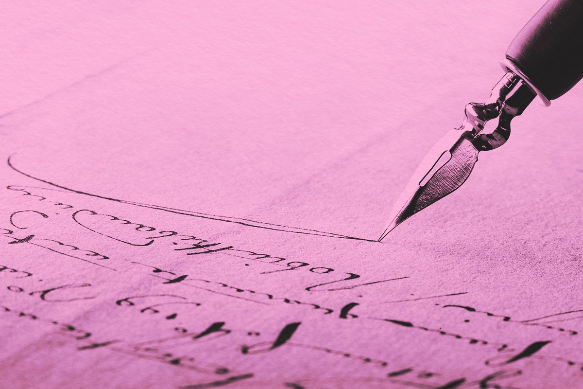
Handwriting is one of our distinct biometric traits, just like our fingerprints, iris, face, voice, and gait — all of which, to varying degrees of reliability and uniqueness, can be used as physical identifiers. For at least a century, handwriting analysts have helped solve a wide variety of criminal cases by examining a suspect’s writing, normally by comparing and matching handwritten samples. And then there are graphologists, who take the examination of handwriting even further, seeing it as a direct expression of our personality. They look at various aspects of our handwriting — from the size of our letters to how we dot an “i” or cross a “t” — with each element potentially revealing a wealth of information, such as our confidence levels, emotional state, and even our general approach to life.
Here we take a look at some of the key components that graphologists look for when examining handwriting, and what each element can say about us. It’s important to remember, however, that graphologists don’t normally focus on just a single, isolated symbol — it’s best to consider the various elements as a whole to get a bigger and potentially more accurate personality profile.
Furthermore, graphology is not the precise study that handwriting analysis provides — take the assumptions about certain personality traits and their connection to handwriting with a grain of salt. Just because you form your letters in a certain way doesn’t mean you’re destined for a particular outcome. Instead, have some fun with the possibilities of graphology and what your handwriting might reveal.
The amount of pen pressure a person uses when writing is a key indicator of emotion for graphologists. A writer using heavy pressure (meaning the imprints of their handwriting can be felt on the other side of the page) is thought to be displaying more emotional intensity. More generally, heavy pressure writers often have strong constitutions and enjoy being active but may also be temperamental or irritable. Soft pen pressure, on the other hand, can be indicative of a yielding, hesitant personality. According to an interview with graphologist Annette Poizner in Reader’s Digest, “This may be somebody who grew up with a dominant or aggressive caretaker or sibling and never learned how to be assertive.”
The way you dot your lowercase “i” also can be particularly telling. A small, precise dot directly above the letter stem suggests someone who is detail-oriented, precise, and methodical. But if the writer replaces the standard dot with a round circle — or even a small smiley face — it’s a strong sign of playfulness (or a desire for attention). A hastily drawn dot that turns into a small, sharp line, on the other hand, could be a sign of irritation or anger.
A preference for strong angularity, similarly, may indicate irritability and anger-management issues, but also honed critical thinking and debating powers. On the other hand, the presence of loops and rounds can indicate a writer with a more expressive, emotional, or sensitive state of mind.
The angle at which your letters lean can reveal whether you are an extrovert (right slant) or introvert (left slant), as can the size of your handwriting. Large, bold letters often belong to extroverts who enjoy being noticed and appreciated. These writers tend to be self-confident and may do well in leadership roles and social situations. Small writing often indicates the opposite — an introvert. According to graphologist John Beck, “The small writer by contrast does not like to be noticed, takes up an analytical attitude to everything, and likes to play a low social profile.” If your writing is medium-sized, it may represent a more balanced personality that can adapt well to different social situations.
Spacing comes into play, too. Generally speaking, the space between handwritten words tends to be about the width of one letter (a good rule of thumb being the width of a lowercase “o”). Gaps that are wider or narrower than normal can be revealing. Wide spacing may indicate that a person values their freedom highly, and particularly dislikes feeling overwhelmed or crowded. Narrow spacing suggests that the writer might crave contact with other people, doesn’t like being alone, and is possibly a bit needy.
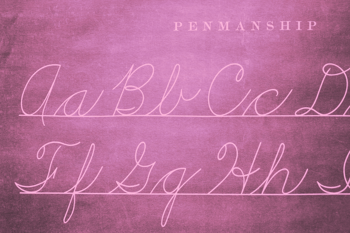
Graphical continuity — the way in which letters connect with each other in each word — is one of the fundamentals in handwriting. As children, we are taught cursive (joined-up) handwriting and print handwriting. What we stick with as adults can reveal information about our way of thinking. People who connect their letters apply logic over emotion — and might also be more conformist, conventional, and predictable. Conversely, disconnected letters might suggest someone who thinks more intuitively or creatively, and acts more on instinct. These shunners of cursive might well prefer to work independently and may be naturally artistic or inventive.
More from our network
Word Smarts is part of Inbox Studio, which publishes content that uplifts, informs, and inspires.